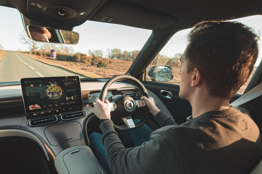
Proper instruments provide all the information you need and no distraction from the joy of driving
Despite having the run of the Autocar test garage and the general aggro and financial burden that come with owning a 20-year-old car, I keep a slightly scabby Mini Cooper S around.
Part of the reason is practical and deontological: it’s always there for a run to Heathrow, and for an objective reviewer it’s rather questionable to be wholly reliant on press cars for transport.
But a large part of why I still love my Mini is that, despite being somewhat modern (it has airbags and stability control), it’s pretty analogue. It ensures that I don’t forget how clutch control and heel-and-toe downshifts work and it has no digital screens to speak of.
Okay, there’s one of those low-tech segmented LCD displays for the mileage and MPG readout, but that’s it. In its own way, it’s an oasis of calm.
When I’m not driving, I’m like many people in that I spend much of my day staring at a screen. They’re useful things: I wouldn’t know where I’d be without Google Maps on my phone and I’d get some weird looks if I filed copy for the magazine written on a typewriter.
But the glare, the colours and the elaborate graphics do cause a good deal of fatigue and general sensory overload.
Despite the intergalactic mileages that I cover every week, driving is still an escape for me, a moment of zen. Sure, sat-nav is useful, but sometimes I actually know where I’m going and just want to concentrate on the driving.
All I need is a rev counter and speedo needle, and I can do without some cartoon fox dancing in my peripheral vision (I’m looking at you, Smart #1).

I’m increasingly fed up with digital gauge clusters. The promise of configurability, of showing you the things you want, almost never materialises. Instead we get zany takes on the speedo that are always the wrong brightness.
A nice set of analogue gauges, on the other hand, is often much clearer and projects a sense of craftsmanship, of design. I have very little interest in Bugatti’s latest zillionaire’s toy, the Tourbillon, but I love what they have done with the analogue watch-inspired gauge cluster.
Morgan’s Plus Four and Plus Six have a digital driver display, but it’s small and easily ignored. Meanwhile, the big round instruments in the middle are such a feature. It’s one of the reasons why I find those cars so oddly relaxing to drive long distances.
I wish they would fully lean into the old-timey vibe and just ditch the screen altogether.
I’m racking my brain for more affordable examples of nearly screen-free modern cars, but other than the Caterham Seven and other ultra-niche stuff, I’m drawing a blank. Even the Kia Picanto has a twin-screen set-up.
I’m not into watches, but I like that the ones that people seem to care about tend to be the more ornate, classic, analogue options, so there’s clearly an appetite for that sort of thing in the mechanical devices we use every day.
Screens are useful, so they are here to stay, but it’s time for car interior designers to stop hiding behind black rectangles.


