Send help and the name of the font that the BMW press office used for its plates in 1990
When you buy an old car, it's easy to get pulled into various internet rabbit holes - buying guides, common problems, popular upgrades, that sort of thing. But I've set foot in a particularly deep and magnetic one-one to rival QAnon and Pizzagate: numberplates.
Modern UK plates are sensible and a bit boring. There's only one legal font and the first two pairs of numbers and letters tell you roughly where and when the car was first registered. Back before 2001, though, fonts were a free-for-all. There was a vaguely standard one, but I've seen everything short of hieroglyphs.
I've recently bought a BMW from 1990, so I had the idle thought of sourcing a set of plates with the same font as the one the BMW press office used in period. I know you're not supposed to put plates on your car in anything other than the current style, but since you're allowed to drive around with old plates, surely no one is going to take issue? Spirit of the law and all that.
Cue a trip to the Autocar archive to look at old pictures of BMWs, and as it turns out even the BMW press office in the late '80s and early '90s couldn't make up its mind which style it wanted to use.
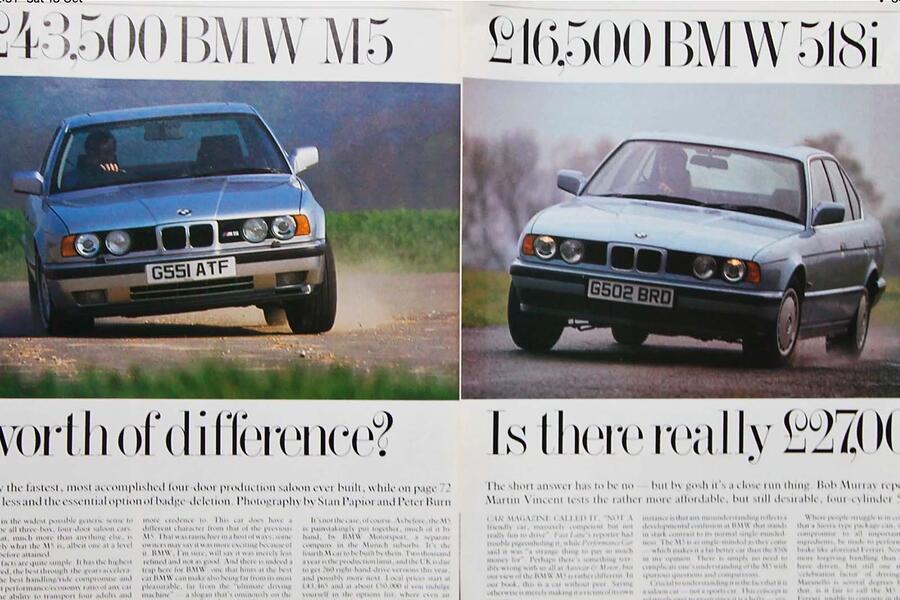
I was soon comparing the pointiness of the letter 'M' in various lurid cornering shots of unsuspecting 3 Series and the length of the horizontal line in the letter 'G' in grainy photographs of 5 Series. Where did they get all of these different fonts? What was their logic? Was there nobody to regulate this chaos?Â
Think things made more sense in other countries? Think again. In Belgium, numberplates stay with people rather than cars, so over the years my family has amassed a random collection of carless numberplates. Some of them I remember being attached to a car, others I didn't recognise, so I decided to do some digging.
There are many dark and awful things on the internet but also some pearls of arcane wisdom. It transpires that some legend named Alain Dupont wrote an 84-page document charting the history of Belgian numberplates, covering everything from the (lack of) logic behind the letters and numbers, to when exactly they switched from enamel to stamped aluminium and how the various provinces were basically fighting over who could allocate which number.
Eighty-four pages and free to access on the internet! God love these people. Thanks to Dupont's work, I've been able to ascertain that 984H6 must have been issued to my grandfather in the second half of 1954, as a replacement for his 50288 plate from the 1940s. Does this information help me in life? Not in the slightest.
A recent European road trip was punctuated by Google searches to figure out why Denmark has partially yellow plates and which German city gets plates that start with MYK. Why does Switzerland get those cute small front plates?
When did France stop using yellow plates on the rear? Why do Irish plates use such an ugly font? Most importantly: why do I care? These are more or less randomly allocated letters and numbers used for various boring administrative purposes.
And yet for some reason I'm annoyed that the one on my old BMW uses the wrong font for the period and that the current tint of red on Belgian plates isn't as nice as the red from 20 years ago. Send help and the name of the font that the BMW press office used for its plates in 1990.

