From the Sony Vision-S and its many screens to the Chrysler Airflow Vision concept and its additional touchscreen in front of the passenger, a theme inside vehicles shown at CES 2020 last week seemed to be the more screens the merrier. Or, if you consider the Byton M-Byte and its awesome pillar-to-pillar 48-incher, the more screen real estate, the merrier.
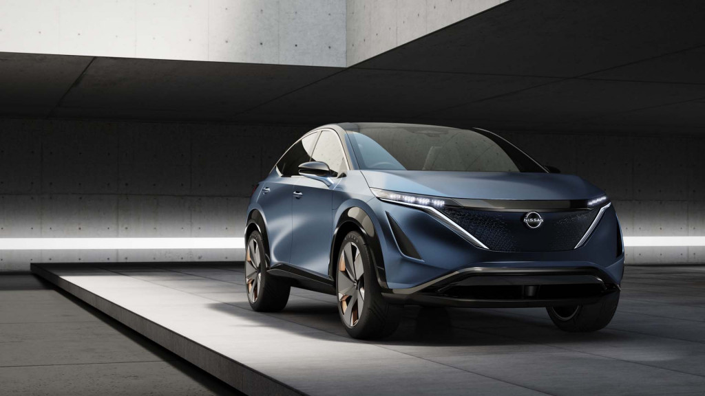
For those who aren’t so thrilled by all the nits and pixels, the Nissan Ariya electric crossover concept stood out. Representing some of Nissan’s future direction with its tech-forward interiors, it has an instrument panel and dash—and entire cabin—that looks upscale but refreshingly minimalist.

Nissan Ariya Concept
It’s part of a new design theme, called Timeless Japanese Futurism, in which Nissan complements adventurous exterior designs with clean interiors—one that is due to extend beyond electric models to the next-generation versions of Nissan’s other more mainstream models like Murano and Rogue.
Alfonso Albaisa, Nissan’s senior VP for global design, said that the decision not to add a bevy of screens was one based on a lot of discussion.
“I think people are going to get tired of these big black screens,” he summed. “It’s a bit of a wall between you and the outside.”
The discussion led to some new priorities. Firstly, Nissan decided that horizontal screens are better—because the human eye tracks sideways more easily and at a much wider angle than it does up and down. According to Albaisa, that’s a specific feature that’s going to be phased in through much of the brand over the next few years.

Nissan Ariya Concept
“The way that we can move information horizontally makes it very natural to read,” he said. “These are big screens and we’re changing the iconography of it, too.”
Although it might not be apparent from all the pictures, the Ariya Concept’s center 12.3-inch infotainment touchscreen, with haptic buttons for climate control and a few other functions direction underneath, flows smoothly into its instrument-panel screen, yet there’s a gap between the two screens that allows the IP to be some distance farther away from the driver.
“This was so you can touch the screen, and then for the area that’s in front of the driver, it’s farther away,” Albaisa explained. “This one is the perfect eye distance, the other one is the perfect reach distance.”
The particular width of the two screens together—about 30 inches—is very natural from the driver’s distance away, Albaisa said, and the polycarbonate display, Albaisa says, “does a Salvador Dali bend” to get those two distances right.

Nissan Ariya Concept instrument panel design
“This was not easy for suppliers,” Albaisa added, in what sounds like a strong hint this will appear in the production electric vehicle based on Ariya.
The display in the other concept Nissan showed at Tokyo last fall, the IMk, uses a method that might not be so production-bound: a projection through a solid triangular block of acrylic.
The design chief noted that it’s all in alignment with the priority of placing content in an easy field of focus, without creating the need for more screen space. Nissan is also hoping to do more with head-up displays and the ability to essentially embed layers of the windshield with information that appears only when necessary.
The future, it seems, might be less cluttered after all.
